Pal
Pal is an assistive digital device for seniors and mobility aid users. Built from real research and a genuine belief that technology should work for everyone.
Roles
UX Research
UI Design
Product Design
Project Context
Type: Team Passion Project
Duration: Fall 2022- present
Tools: Figma, Keyshot, Rhino, Miro
Project Deliverables
Assistive Technology
Assistive digital device
Interface Design
An empathetic and powerful team of three — two UX designers and one product designer. I led UX research, wireframing, concept planning, and the overall design direction of the device.
THE PROBLEM
There is always concern for our parents and grandparents living away from our 'new' homes but knowing we can keep in touch makes us happy. But, look at the other end, how easy is it for your family members 70+ to use the same technology you are using to keep in touch?
Digital independence gets difficult, especially for those in a wheelchair and who use a walker. Multitasking on mobiles can often force extra cognitive processing, resulting in reduced motivation levels to engage with smart devices. Seniors find it difficult to participate fully in mainstream technology.
Here's a truth we need to hear: Unfortunately, most technology is not tailored for seniors and their needs.

SECONDARY RESEARCH INSIGHTS
We conducted extensive secondary research to keep well aware of existing problems and solutions.
U.S statistics show that “23% of older adults indicate that they have a physical or health condition that makes reading difficult or challenging”
"77 percent of seniors report that they would require assistance were they to try and learn how to use a smartphone or tablet"
"Additionally, of those who are already on the internet but do not use social networking sites, 56 percent say they would need help to connect with friends and family"

I took a course: Accessibility: How to Design For All, to further connect myself with my interest and deliver seamless UX for the elderly.
Insights gathered in understanding digital accessibility for senior citizen. This is currently helping us adhere to accessibility guidelines while building and testing our interface.

PRIMARY RESEARCH


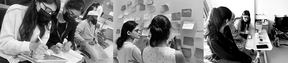
Observed struggles faced in coordination between caretakers, staff and individuals on a wheelchair
During our hospital and nursing home visits, we spoke to nurses, family members of the elderly and other individuals with minor mobility issues to get a medical point of view too
We had open-ended discussions with the caretakers at assisted living homes and the residents. We got crisp insights into their pain points and goals via contextual research.

Current method of keeping track/ setting reminders of individual's needs at nursing homes
TARGET AUDIENCE
Senior citizens (70+) living alone/ away from family members.
PRIMARY RESEARCH ANALYSIS
This was the main structure on which we based our questions to seek appropriate and insightful answers via contextual inquiry and interviews. The more personal questions we asked our grandparents and known senior citizens.
1. We noted observations from contextual inquiry focusing on the interaction with technology, and communication with caretakers and family members.
2. Activities of the Caretakers.

PRIMARY RESEARCH ANALYSIS
We mapped out and grouped findings to form insights via the affinity mapping technique

Affinity mapping
We formed common themes based on the insights we extracted

"Technology should be digitally accessible as well as not add strain to those on mobility aid such as wheelchairs and walkers."
HURDLES AND ITERATION FOR IDEATION
How are we different from competitor brands?
Through our interviews and observations, realised that senior citizens faced issues on a broad scale while operating devices, especially those who use mobility aids. With this, we decided to expand our product's reach to meet the needs of a larger audience in the 70+ age category.
We incorporate the caretakers and the family members into the device loop via a simple application, not just to stay connected for leisure, but to keep up with their medical needs and daily requirements.
Make the device FUN (entertainment, games) and not only for assistance! We aim for inclusion and assistance.
CONCEPT BUILDING
Staying connected, independent and safe. And have Fun!

BRAINSTORMING
1. Designing an application linked to the device for the caretakers and family members to stay connected.
2. Creating a product also attachable to mobility aids to further increase usage for a broader audience.

Product Ideation (mobility-aid friendly concept)

UI Ideation
DESIGN ITERATION 1
Once we conceptualized our base idea of the interface we proceeded to create digital wireframes

Low Fi concept for mobile application

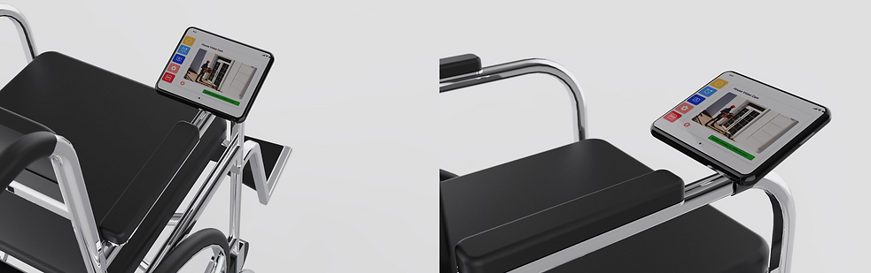
PRODUCT CONCEPT (PORTABLE AND MOBILITY AID FRIENDLY) LOW-FI
PRODUCT CONCEPT HIGH-FI


UI TESTING
We re-visited the assisted living homesto test our interface. We conducted moderated task-based testing for the care takers (mobile application) and the elderly (assistive device UI)
Steps:
-
Briefed them on the concept.
-
Asked them to perform pre-decided tasks one by one.
-
Asked for feedback after the completion of each task and took notes based on observation while the task was being performed.
-
We asked for overall feedback from the caretakers and doctors.
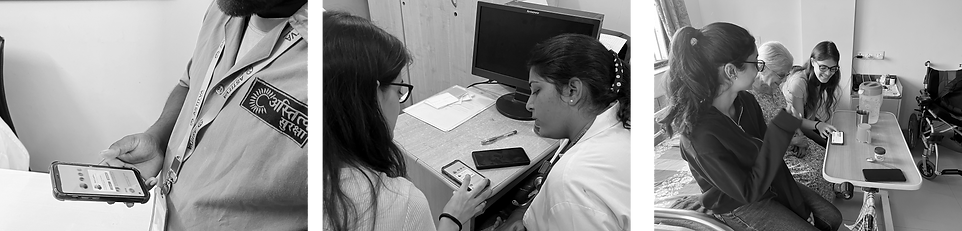
Testing the mobile app with the caretakers
Giving a brief explanation of the concept to the nurse and doctors
Giving a brief explanation of the concept and testing the assistive device UI
ITERATION AND FEEDBACK
"Increase the dimensions of our product"
Why: Current dimensions are comparatively smaller to play games such as digital colouring, and e-board games.
"Reduce navigation via touch screen"
We decided to add a button for certain navigations such as 'enter' 'select' to reduce the error rate, as touch screens can get difficult for seniors to manoeuvre.
-
We found the surface area of the buttons were small.
-
We were suggested to keep the reminders tab optional for the elderly
-
Keeping UI consistent.
-
Some areas required an increase in the font size.
-
Adding memory-based games that can help tease the brain and improve cognitive processing. (digital colouring, puzzles )
-
Differentiate headers and subheaders with text hierarchy instead of colour variation. (grey is a low contrast colour)
TEAM MEMBERS
-
Riya Bajaj: UX Researcher UI Designer
-
Krisha Chauhan: Product Designer
-
Divya Mavinkurve (me): UX Researcher, Designer
We are currently working on the identified changes. Being new to digital accessibility it may take us a couple more rounds of testing and iterations. We are excited to explore and learn further! Stay tuned.