Which product is right for you?


Team Members
-
Divya (Me): Usability test moderator, Data Analysis, Notetaker
-
Liam Zhao, Tammy Yan, Yuka Fan
Project Context
-
Amazon sponsored project via HCDE UW
-
Jan 2024- March 2024
Project Deliverables
-
Usability Analysis
-
Remote Usability Testing
-
Insights and Recommendations
PICTURE THIS
Make the Amazon Comparison Chat your hero
Imagine you're on the hunt for a new Amazon Fire tablet, seeking clarity amidst a sea of technical jargon. As you weigh the significance of "6x up to 2Ghz" and ponder whether 6 hours of battery life will suffice, you stumble upon a comparison table. Will this purchase elevate your digital experience or simply add more layers of confusion?
OVERVIEW
Analysing and evaluating customers' experiences with the consumer electronics comparison charts in partnership with Amazon Devices to enhance usability
| Link to Slide Deck
ACTION ITEMS
The goal of this research included assessing scannability, decision-making support, and discoverability, with specific questions regarding user needs, device impact, comparison to competitors, and shopping behavior. Based on the given problem statement our team defined three main action items in collaboration with the Amaozn Devices team

Our team conducted Remote Moderated usability Tests via UserTesting and Zoom. During the tests, my responsibility was to moderate the interviews and take notes.

RESEARCH PLAN
THINK ALOUD TASK BREAKDOWN

PARTICIPANT PROFILES
For our Remote Moderated usability Tests we recruited a total of 12 users interested in buying Tablets in the past 6 months or in the future (10 participants + 2 Pilot ).
Our research targeted a diverse demographic comprising individuals aged 18-50, excluding those working in the fields of technology, research, or journalism. This demographic included both frequent and infrequent shoppers, encompassing an equal mix of Male and Female and Amazon device owners and non-owners.
PARTICIPANTS

CRITERIA DESKTOP AND MOBILE USERS

COMPETITOR CHARTS
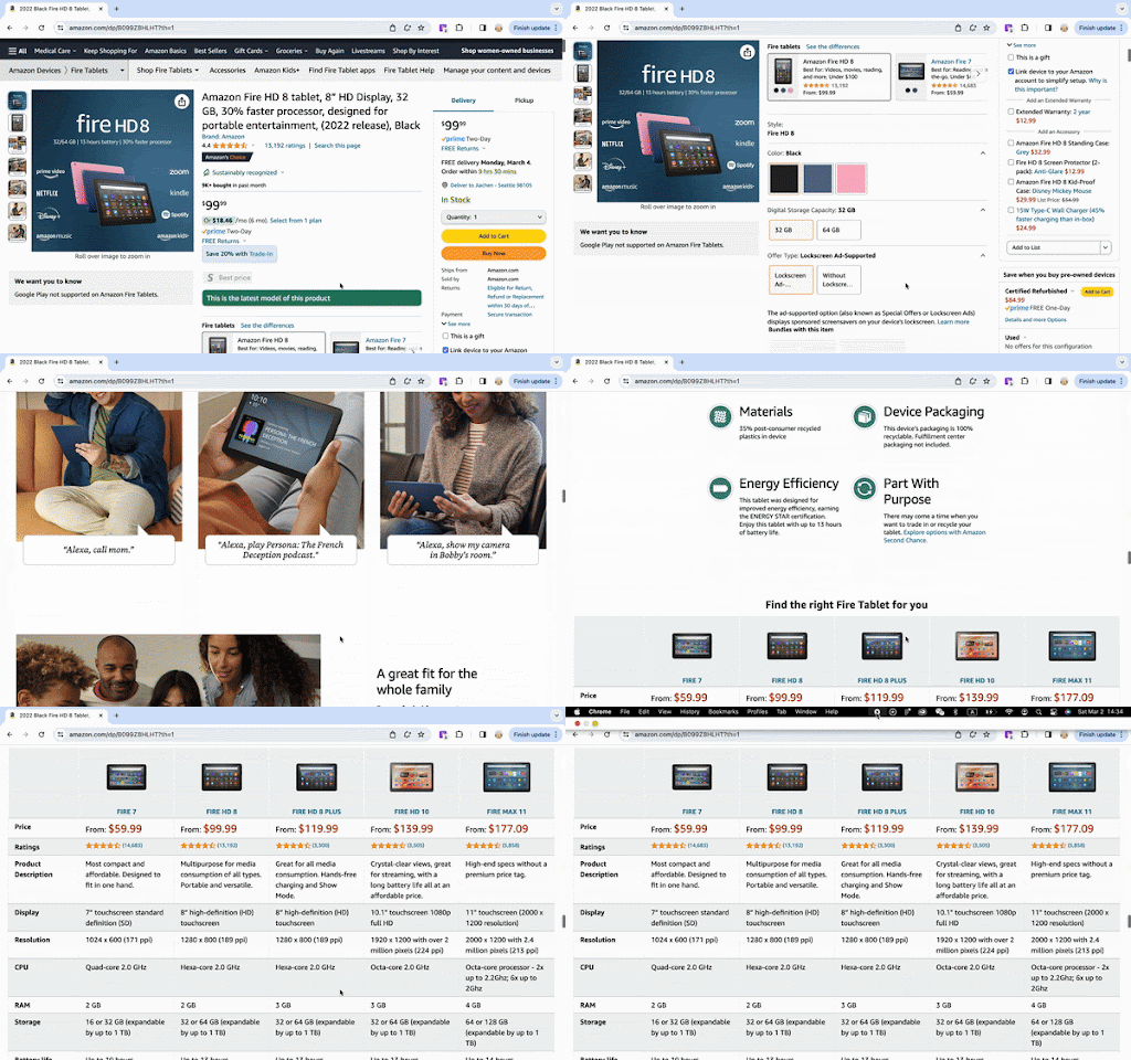
We gathered data for third-party consumer electronics comparison charts, including those from the Apple iPad website, the Samsung Tablet website, and the Best Buy website. Here is a quick preview of how the competitor charts look.

DATA ANALYSIS
QUALITATIVE DATA
Data on Where users click, Why users leave the page, When and Where they go after leaving the pages, and their think-aloud thought processes were recorded.


QUANTITATIVE DATA
Likert scale ratings for each comparison chart were represented in dot graphs for easy comparison between participants.

INSIGHT AND RECCOMENDATION
After conducting a comprehensive comparative study with competitor charts, our team presented insights to the Amazon Devices team and collectively brainstormed on how we could better the usability of the Amazon comparison charts.

1. Comparison chart page placement location matters - with more emphasis on the Amazon Consumer electronics website as compared to the competitors

“The Frie Tablet chart was very useful. I would just say the placement of it. Being all the way down at the bottom wasn't as helpful, just because you have to scroll through all parts of it [the amazon detail page].” - [P4, desktop user, owner of Amazon device, late in shopping journey]

DISCUSSION AND RECCOMENDATION
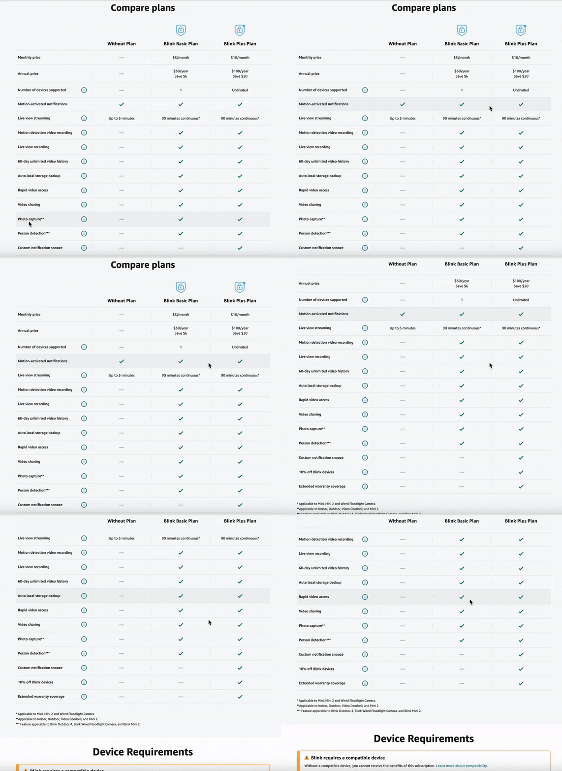
The Amazon Blink Chart performed better than the Amazon Fire Tablet chart in terms of user engagement.
Further user research is necessary to optimize the placement and design of the comparison charts for enhanced discoverability and user engagement. This may involve A/B testing to evaluate user interaction based on chart placement (higher vs. lower on the page) and the effectiveness of a strategically positioned on-page link directing users to the chart. The insights gained from these tests will inform design and placement decisions to improve chart discoverability, ultimately leading to a more streamlined shopping experience and informed decision-making for users.
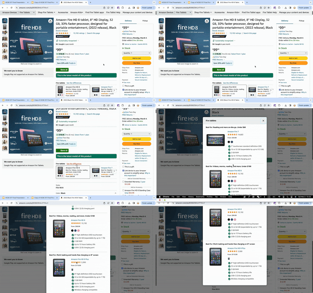
2. Users interacted with the “see the difference” within Pick-A-Version instead, missing the more detailed comparison chart located lower on the page.

“ I have seen the comparison chart on Amazon. It just didn't occur to me right away, because I saw the “see the differences”. And to me I thought that was replacing the chart in my mind.” - [P5, desktop user, owner of Amazon device, early in shopping journey]


DISCUSSION AND RECCOMENDATION
This observation revealed a potential link between shopping stage and chart preference: early-stage shoppers interacted less with the comparison chart, and they tended to use a quick overview (“see the difference”) that highlighted key differences to narrow down their initial choices.
More testing is still needed to better understand the link between shopping stage and user behaviors. What are the differences in information needs for early-, mid-, and late-stage shoppers? How would they engage with the comparison charts differently? Understanding of such a correlation will not only boost engagement with the comparison chart, but also inform future redesign that would better cater to the needs of customers in different stages of their shopping journey.
3: Users prefer scannable charts to easily find differences across products

“Because my eyes were looking for differences, the green checkmarks [in Blink chart] make it very easy” – [ Pilot 1, mobile user, mobile user, owner of Amazon device, late in shopping journey]
“I hope differences are highlighted in the chart: most things seem to be similar. When I use a chart, the most important thing is to look for differences, but with the current chart you have to read everything.” - [P9, mobile user, owner of Amazon device, early in shopping journey]


DISCUSSION AND RECCOMENDATION
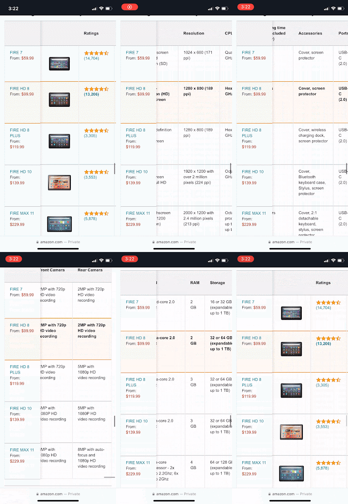
Having less columns to compare in amazon fire tablet chart in the mobile version, and having more visual cues instead of texts might improve this issue. Further testing is needed to confirm the optimal amount of models to compare in the chart.
The finding shows that people liked visual cues in the chart to see the differences. Especially for the Blink chart, people mentioned that the check marks made it easy for them to quickly see differences in the chart. From our observation, most users (both desktop and mobile) compared only the first 3 columns (Fire 7, Fire HD 8, Fire HD PLUS) in Amazon Fire Tablet Chart.
4: Users don’t like excessive scrolling, and have varying preferences regarding scrolling orientation on the mobile device

“I wish I can open the chart into a full screen instead of scrolling” - [Pilot 1, mobile user, owner of Amazon device, late in shopping journey]
“Too much scrolling - i don’t like to go back and forth to see what’s the product (the image)” - [P6, mobile user, owner of Amazon device, middle in shopping journey]


DISCUSSION AND RECCOMENDATION
The scrolling back and forth might improve if the product image is included in the sticky headers, but it should be tested with A/B testing.
Vertical scrolling appears to be slightly more popular than horizontal scrolling, but further testing is required to confirm this by comparing the same information presented in charts, rather than charts displaying different information.
5: Customers look for different data that are relevant to their needs, and it is not a one-size-fits-all

“ So I don't care about everything like every single feature in that device. So what's important to me for a tablet will be screen quality processor and battery life, simple things that pertain to how I'm gonna use the device…” –[p3, Desktop, owner]


DISCUSSION AND RECCOMENDATION
The number of products users prefer to compare at a time varies depending on the device used. For instance, on mobile devices, users typically prefer to compare fewer products at a time than on desktop since they find large amounts of scrolling inconvenient.
Different users have different preferences when it comes to the specifications of a product based on their needs and the intended use. Identifying commonalities between the desired specifications can help prioritize information hierarchy in a comparison chart.. Conducting further testing can assist in understanding overlapping themes of user wants and needs. This ties into information clarity, where the most relevant specifications for a product, such as those highlighted by users, are represented in bold and with iconography at the top of the chart.
6: Users prefer real-world implications of labels over technical terms

“The thing that's annoying about the CPU was it doesn't really help me understand, like the Gigahertz, in terms of how fast any of these are until you get up to the fire. Max. 11. Mike: Then it's actually showing me that it's up to 2.2 gigahertz 6 times up to 2 gigahertz. I'm not sure what that even means…”


DISCUSSION AND RECCOMENDATION
Besides how the information is displayed visually, the perceived info clarity is one of the key factors in determining how scannable the information in the comparison chart is. Thus it’s recommended to (1) display information in a clear, easy-to-understand, friendly way for new users (2) provide an easy way for the user to learn more info with options like info icons, especially for labels or specifications that are highly technical.
RETEROSPECTIVE
If we had more time:
1. Re-design recommendations with graphics or illustrations
2. Conduct further usability testing on recommended items in the "Discussions" section
3. Conduct further research and probe into "The Blink Chart".
Learnings
